Designing a Modern Blog UI: Latest Articles Section & Sidebar (Complete Guide)
Introduction
A well-structured blog layout is critical for readability, engagement, and conversions. In this guide, we break down how to design a modern blog interface featuring a Latest Articles section and a multi-functional sidebar, based on production-ready UI patterns.
This design approach focuses on:
Clean visual hierarchy
Responsive grid systems
Subtle interactions and hover effects
Conversion-driven components like newsletter signup
Modern Hero image page and Featured posts page next js Tailwind css
Build a Modern Navbar ISR in Next js Tailwind Css
📰 Latest Articles Section
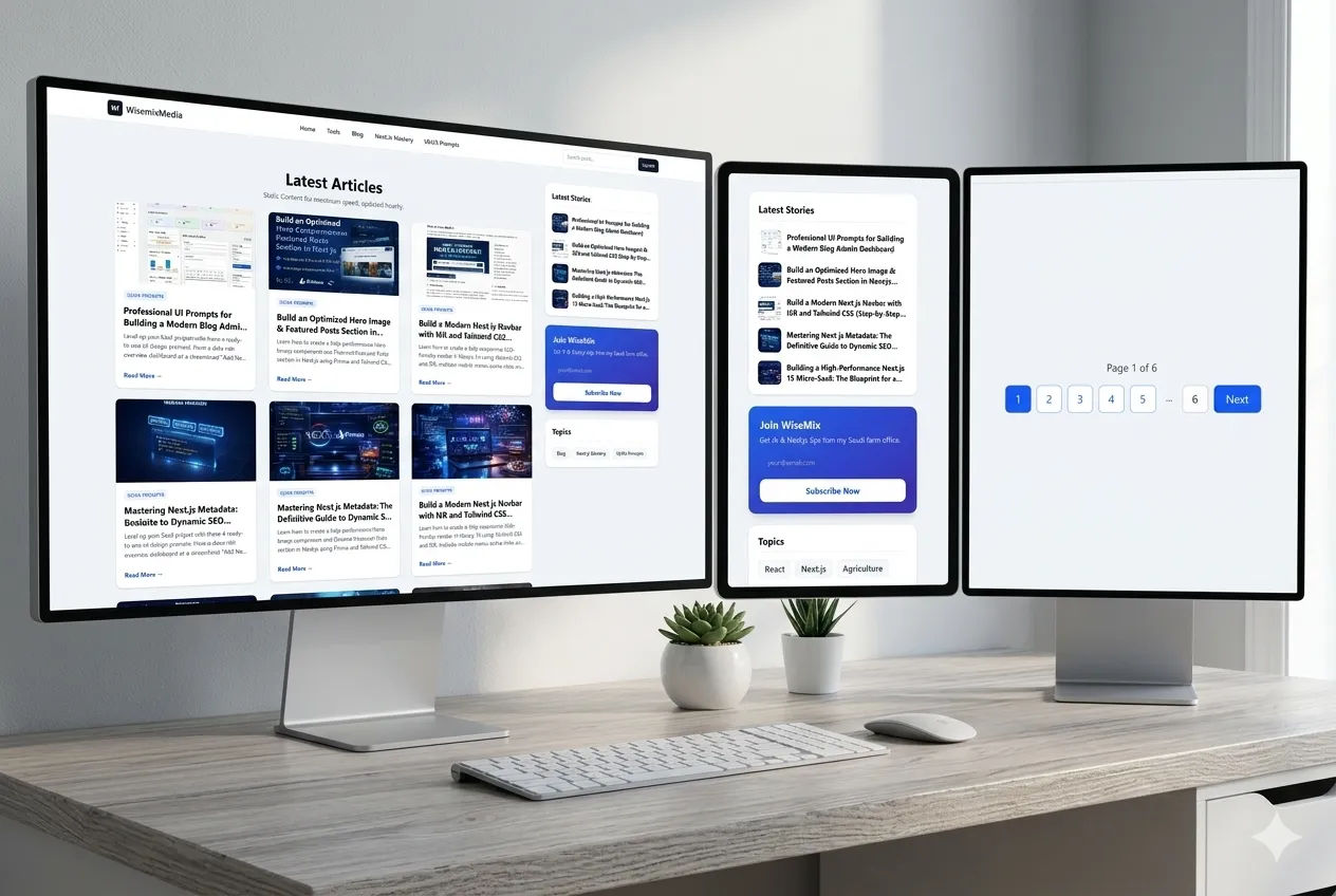
The Latest Articles section acts as the primary content discovery area for users. It must be visually appealing, easy to scan, and responsive across devices.
🎯 Layout & Structure
Use a soft light theme with background color:
#F9FAFBContent should be placed inside a centered container
Apply generous vertical padding for breathing space
🧩 Header Area
Center-aligned heading:
Default: “Latest Articles”
Dynamic: “Search Results for ‘query’”
Add a muted subtitle explaining the content list
📱 Responsive Grid
Desktop: 3 columns
Tablet: 2 columns
Mobile: 1 column
This ensures optimal readability across all devices.
🃏 Article Card Design
Each article card should follow a consistent visual hierarchy:
1. Image
Aspect ratio: 16:9
Positioned at the top
Add hover zoom effect (scale slightly)
2. Category Pill
Small uppercase text
Style:
Text: Blue
Background: Light blue
Helps in quick categorization
3. Title
Bold, maximum two lines
Clear typography hierarchy
4. Excerpt
Short, muted description
Provides quick context
5. CTA Link
Text: “Read More →”
Hover effect:
Slight right slide animation
✨ Card Styling
White background
Rounded corners
Subtle border
Soft shadow
Hover Interaction:
Shadow deepens
Image zooms slightly
🔢 Pagination
Positioned at the bottom
Separated using a thin top border
Keeps navigation clean and accessible
📚 Sidebar Design (Sidebar.jsx)
The sidebar complements the main content by improving navigation and engagement.
🧱 Overall Layout
Vertical stacked cards
Consistent spacing between cards
Clean, minimal aesthetic
📢 Card 1: Advertisement (Optional)
White rounded container
Thin gray border
Soft shadow